Silent Wanderings
The brief I received for the Silent Wanderings logo
was, and I quote, "Something we can put on letters and things. Oh, and it
should be simple yet modernish."
Silent Wanderings didn't have a logo prior to this
so I had nearly free rein on the outcome of it.
Return to the gallery collection here.

|
This image is the filler image to fill empty table
cells. I made so the empty cells looked better. |
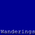
| My friend wanted a a logo for stationary and for the website.
This image is the logo for the side menu where it acts as a HOME button. |
|
|
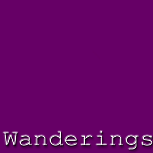
This is the main logo found on the front page. It also is
the image designed to go on letterheads. |
| This logo is virtually the same as the previous one. I just couldn't decided
which one should be the main logo. Luckily the site wasn't for me so the one above
was chosen. |
|
| |
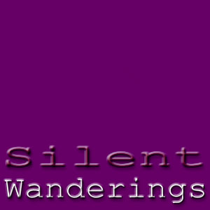
A not so silent wandering. This is the first logo I made
for the site. The text is embossed and has a slight inner glow. I also added a
drop shadow to enhance the embossing. |